Somehow I managed 5 years of design school in the early 2000’s without hearing about this acronym. It’s likely the acronym did not reach the height of popularity until after I graduated. Nevertheless, I entered design school for ILT grad studies in the twenty-teens and picked up where I left off in Joni Dunlap’s “Creative Designs” course. These CARP principles were already burned into my brain but one has always stuck out for me ̶ CONTRAST!
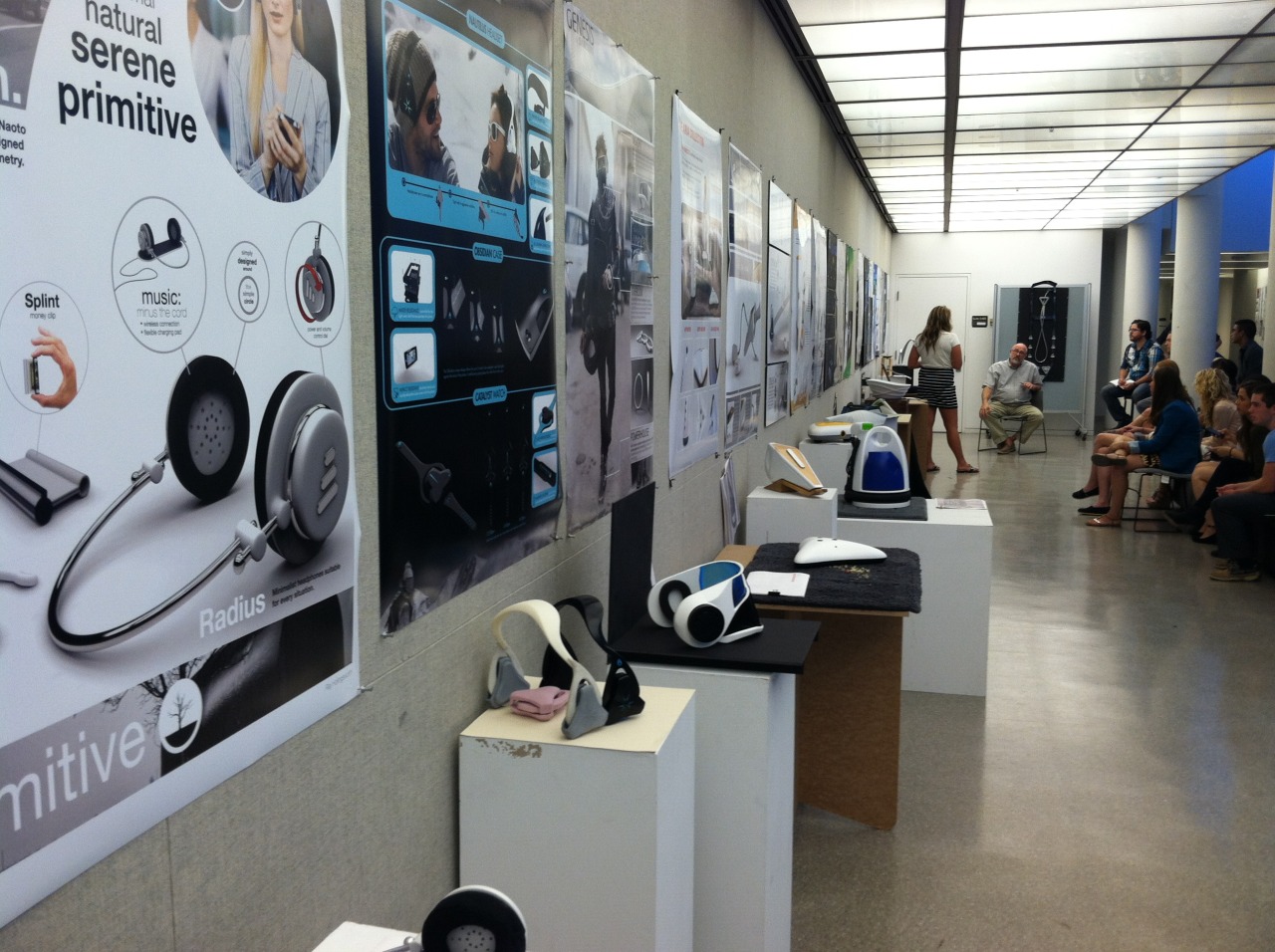
During undergraduate design schooling we would often create sketches and designs to critique by posting them on a wall and standing back 15-20 feet to talk about them. Often, a quick glance would reveal glaring errors in application of these principles. The biggest culprit ̶ CONTRAST! Standing at this distance the images would fade into the background if there was not the appropriate usage of contrast.
Professor Tony Kawanari would say it again, and again, in a myriad of different ways, “MORE CONTRAST!” Sometimes with a stack up papers rolled up to form a trumpet over his lips. But my favorite was always the exclamation combined with a katana slice with a metal cork-back ruler!
Tony is a Japanese American man who lovingly shared his culture with his students in combination with his love for design and humor. We were all privileged to learn from him and I will never forget about contrast as perhaps the most critical of design principles.
Without contrast, the rest of the principles are moot because a viewer may not be able to see the design in order to evaluate anything.
In regards to the discussion of webinars, for the course I am currently taking at University of Colorado Denver, contrast likely plays a strong role in the success of the presentation. The slides in a webinar, similarly, are like looking at something far away to critique because the view-port presentation window is only a portion of the screen. Additionally, the quality of this presentation is limited to the available bandwidth for the attendees and the video quality of the webinar platform. Case and point ̶ contrast matters!
This does not suggest the other principles don’t matter or aren’t as integral to a design presentation. The combination of these elements working together usually produce the best visual results. Ultimately, the purpose is to make it easy for the viewer to understand the message behind the graphics without being confused by lack of quality use of principles. To the point that it looks effortless or subconscious. It’s likely most people take this for granted, but behind every good design there’s one-hundred visual experiments and one-thousand pixel nudges. There’s no perfect equation to apply CARP well. The best way to learn how to do so well is to practice. Eventually, the application becomes instinctual.


Comments
Post a Comment